|

|
Schiller Institute International Conference in Paris, June 13-14, 2015
Professor François Gervais : The Innocence of Carbon

14 June 2015
François Gervais, Emeritus Professor of the François Rabelais University , Tours; and a Critical Rapporteur to the IPCC ARS5 (International Panel on Climate Change), Tours, gave the following presentation at the Schiller Institute International Conference in Paris, June 13-14, 2015. Good afternoon. I would like to start by thanking the Schiller institute for giving me the opportunity to present my research at the Francois Rabelais University of Tours. These works have been published in English in the International Journal of Modern Physics and in French by editor Albin Michel. The essence of my investigation can be reduced to a single question. Does the Real Climate validate the Virtual Climate Models? We will develop here in particular the fact that climate scare mongering is not based on scientific measures, but exclusively on the projections of climate models that extrapolate data to the end of the century. Hence the importance of the question. Are they validated by scientific observations? The World Bank, as everyone knows an expert institution in matters of climate, recently evaluated the costs of the battle against carbon dioxide, CO2, emissions produced by combustion of such fossil fuels as coal, oil, natural gas or shale gas. The cost of that fight is evaluated by the World Bank at $89 thousand billion. In other words, $16 billion per day between now and 2030. This gigantic effort is supposed to limit the warming of our planet due to greenhouse gas emissions below the 2 degree Celsius level.
In front of such a challenge, the first thing to check is to inquire if in the recent past CO2 emissions have really provoked a rise in temperature? Now you have this (Figure 1) in front of your eyes and the correlation is far from being evident. Since temperatures went down as emissions started to accelerate, and temperature increased by the same 0.6 degrees Celsius between 1910 and 1945 while CO2 emissions were still weak, as it did over 1970 to 1988 when emissions were 6 times greater. So the correlation is not self evident. Which are the greenhouse gases in the air? The answer is simple. Those whose molecules are composed of at least 2 different atoms. The principal greenhouse gas is water vapour. [1 - 5% of air by volume] Far behind water vapour stands CO2. Its concentration in the air went from 0.03 percent to 0.04 percent in one century. What can be the impact of this increase on the Earth’s temperature? More precisely, what has been its impact on temperature as measured by satellites positioned at 17 kilometers altitude? Why this altitude? Because it is in the higher part of the atmosphere, i.e. the lower stratosphere, the region where atmospheric pressure is the weakest that the greenhouse theory anticipates detection of the clearest signature. By contrast on the Earth’s surface, the pressure is more elevated and the effect is already close to saturation. In fact, the temperature hasn’t risen significantly or measurably inside the limits of experimental certitude for nearly 20 years. Between 1993 and 2015, the level of CO2 in the air went from 355 parts per million (ppm) to 400 ppm, i.e. half of the total increase since the beginning of the indust-rial age in the 19th century. What was its impact on temperature? You see it here, zero. No measure-eable evolution has been observ-ed. Conclusion? The theory of the atmospheric greenhouse is not verified by scientific measure-ments. And it is on the basis of this non-valid theory that the climate mod-els are anticipating global warming. The Arctic sea ice melted to a low point in 2012, normal since we went beyond the high point of a cycle the first decade of the century. But look how fast the volume of ice at its minimum (at end of summer 2012) grew again these last two years while the alarmists predicted that it would disappear by last summer. This was Al Gore. In reality the total sea ice (the curve down to the left) has a surplus since two and a half years. Contradicting in this way the climate models adopted by the IPCC.
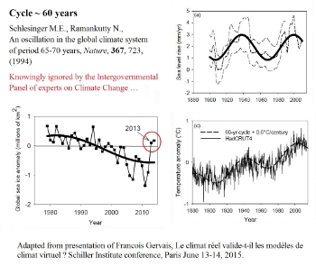
In effect, where is the impact of CO2 emissions? Since the surface area of the sea ice has become once again in a surplus. This cycle of about 60 years demonstrates itself not only in matters of temperature and the variations of surface area of sea ice, but also on the rise of ocean levels. (Figure 4) As Nobel Prize winner Richard Feynman said, if a theory is not confirmed by experience, it is wrong. It doesn’t matter who proposed it, if it is not confirmed by experience it is false.
Was global warming observed on the surface of the Earth? Yes. But it originated in part from a cyclical phenomenon. We went from the highest point of a 60 year cycle, now temperature is gradually decreasing. (Figure 2.) This is visible if one zooms in on the temperature measurements of the British Hadley Center and correlates them with various measures obtained by satellites (in the lower box). No climate model adopted by the IPCC, the Intergovern-mental Panel on Climate Change, has anticipated this negative evolution. Admit-tedly, since the tendency observed remains below the range of fluctuations, the issue needs to be followed up.
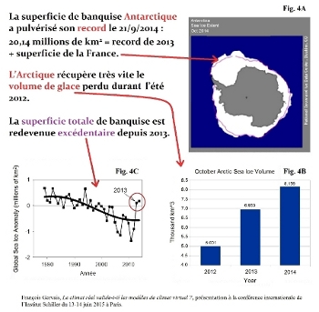
The media, always pumped to announce records, did they announce the last record of the size of the sea ice in Antarctica pulverized on September 21, 2014? It surpassed the last record of 2013 by a sea ice surface equal to the surface of France. Why this silence? (Figure 3) The Arctic sea ice melted to a low point in 2012, normal since we went beyond the high point of a cycle the first decade of the century. But look how fast the volume of ice at its minimum (at end of summer 2012) grew again these last two years while the alarmists predicted that it would disappear by last summer. This was Al Gore. In reality the total sea ice (the curve down to the left) has a surplus since two and a half years. Contradicting in this way the climate models adopted by the IPCC. In effect, where is the impact of CO2 emissions? Since the surface area of the sea ice has become once again in a surplus. This cycle of about 60 years demonstrates itself not only in matters of temperature and the variations of surface area of sea ice, but also on the rise of ocean levels. (Figure 4) The data here are those of the figure 314 of the AR5 report of the IPCC, here compared to the 60 year cycle.
In the 2 reports that I sent to the IPCC beginning in 2012. I indicated to them references to this cycle and published it in international scientific journals. It is therefore with full know-ledge that the IPCC made the choice to ignore the natural variability in its report. In science this is called cherry picking, selective choice, not science.
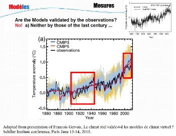
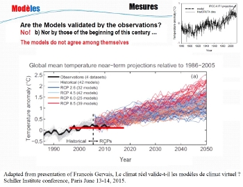
Once you ignore this cycle, the models CMIP3, CMIP5 of the IPCC reports are incapable of identifying the climate of the past. (Figure 5) In particular the rise of 0.6 degrees between 1910 and 1945. It is blatant. They diverge equally from the measurements made since the beginning of this century, (Figure 6) as we shall now examine in detail. First remark. Look at this forest of spaghetti! All these models disagree among themselves, including those adopting the same scenario of emissions. Second remark. Since the temperature didn’t rise since the end of the last century, their projections are system-atically above the measurements. Finally, no model ever anticipated the small decline in temperature since 2002 measured by the most precise instruments that humanity has today, the satellites. If this decline continues and eventually amplifies, let’s bet that the climate modellers will be in deep trouble. And even more the politicians that have gauged their careers on the IPCC predictions.
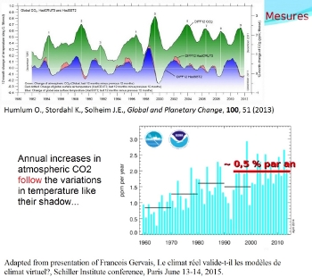
The models consider various scenarios of CO2 emissions. But what do measurements teach us about that? They show (Figure 7) that the yearly increase of CO2 in the air varies from one year to another. It can be as little as 0.1 percent or reach 0.75 percent. The yearly increase is low when the Earth is momentarily colder. It is much bigger when the Earth is under warm temperature fluctuations like El Nino. The blue curve represents the fluctuations of temperature. The increase of CO2 is the green curve which follows as its shadow, arriving 9 to 11 months later. Without exploring all possible interpretations which the IPCC likes to ignore, even when the critical proof reader, which I was, invites them to discuss the matter, We must ask what is the yearly average increase of CO2 in the air? Close to 0.5 percent per year for 20 years. At that pace the rate of CO2 emissions will be far from having doubled by the end of this century. The Climate Sensitivity, or Climate Response, is defined as the rise in temperature with doubling of CO2 concentration in the air. The IPCC report claims that it will be between 1.0 and 2.5 ° Celsius. But Figure 11.25 of the IPCC report considers the lowest temperature as the most probable. This judgement isn’t taken up in the Summary Report for the attention of the decision makers. Three articles more recent than the AR5 report indicate a Climate Sensitivity of between 0.6 ° C and 1.4 ° C, [bracketing] the low value of the IPCC. At the current rate of 0.5 percent yearly increase of CO2 over the last 20 years, a simple calculation suggests a temperature rise between 0.3 degrees and 0.6 degrees by 2100. Should we all scream catastrophe? Between Friday June 5 and Saturday June 6, temperature in France dropped by 15 degrees in 24 hours. The southern wind turned north. Women in nice light clothes returned to their pullovers overnight. But will we really feel a virtual increase of 0.3 to 0.6 degrees over a whole century? The real global warming came to an end. The CO2 emissions which continue with the same speed can not therefore be accused any longer. Low and behold, as a scapegoat, CO2 is accused of being responsible for everything: storms, hurricanes, drought, floods, waves of cold in the United States and Canada, and in the same vein of momentary enthusiasm, tsunamis and earthquakes, all blamed on CO2. Hence the measurements show that the accumulated cyclonic energy has a tendency to decrease, as one can see on the blue curve over the last 20 years. (Figure 8) Torricelli invented the barometer three centuries ago. He readily saw that lower air pressure announced rain, and that even lower pressure announced wind and even a storm. With a medium pressure, the weather remains uncertain and variable. On the opposite side, high pressure inaugurates nice, stable weather. Did we forget all of that? A Minister with whom I confronted during a debate on French Radio RTL, did forget. I told him on a simple thermometer there are no figures indicating storm, rain, wind. These indications are reported by a barometer. He told me I was not a scientist. Finally, all those who pretend to be greens, because they have a tendency to forget it. CO2 through photosynthesis and through the production of glucose, C6H12O6, a sugar, a food stuff indispensable and irreplaceable for vegetation, especially for nutritive plants, harvests. (Figure 9) And at the same time regenerates the oxygen in the air. The CO2 in the air increased over a century from 0.03% to 0.04%. Is that too much, or too little? In Spring and Summer in the Northern Hemisphere, one observes each year a drop of the CO2 in the air consumed by an outburst of growth of seasonal vegetation. The amplitude of that drop has increased from 1969 to 2013 as measured in this graphic at La Jolla in California. Its amplitude has increased faster than the rate of CO2 itself. Proof that vegetation seems always in need of its preferred food. This effect is collateral and eminently beneficial for mankind. The benefit of the higher yields of harvests has even been calculated at 3,000 billion euros since 1961. (Here) So why should we fight it while the miniscule effect on temperature doesn’t seem to hinder this increase in yields and harvests? To conclude, let me say this. More than 1350 articles in the international scientific journals exclude all risk of warming beyond 2 degrees C, and they all underline the natural variability of the climate. The number of these articles has doubled since 2007, and the number 1350 articles is to be compared to the 1637 articles of the data web of Science found by crossing keywords [anthropogenic] AND [greenhouse OR CO2] AND [warming]. Other articles generally going in the direction of the conclusions of the IPCC, do nothing more than report the observations the scientists are using as I have done to demonstrate that there is no correlation between temperature and atmospheric CO2. Or to simulate the impact on such and such ecosystem, IF the temperature rises by 2, 3 or 4 degrees C, etc. If the temperature rises? Let us be assured. It is not rising any longer. Scare mongering and catastrophism is uniquely based upon climate models. By definition every model, being a model, is more or less wrong. In the case of climate models, the climate sensitivity is reportedly between 0.6 and 2.5 degrees C [for a doubling of CO2]. It means they are disagreeing among each other and recognize an uncertainty rate of 2.5/0.6 = 417 percent. The most alarmist of them are not validated by scientific measurements. Should we trust them when the evolution of the real climate does not really appear worrying? |